The 18,614 people in the stands at the Missouri football spring game Saturday were on their feet, but it wasn’t because a Hail Mary was mid-flight or because a runner had broken free and was trotting to the end zone. Really, it had nothing to do with football.
“I bet some didn’t even want to see the game,” sophomore quarterback James Franklin said, laughing. “They just wanted to see the jerseys.”
On the south end of the field, smoke was blasting. Small strobe lights were cracking white.
“Back up!” a man was shouting to the media crowding the tunnel. “Back up! Back up!”
Finally, it was 4-14-12, the digits that the university had used as a logo in its string of promotions for the past three months leading up to the date.
“Today,” the announcer said to the applause, “we are excited to reveal new uniforms for five of our Mizzou teams.”
Through the tunnel first came members of the soccer team, wearing black and white uniforms with gold numbers. These gold numbers would be seen in the same font on the chests of the men’s basketball, volleyball and women’s basketball teams as they emerged through the smoke.
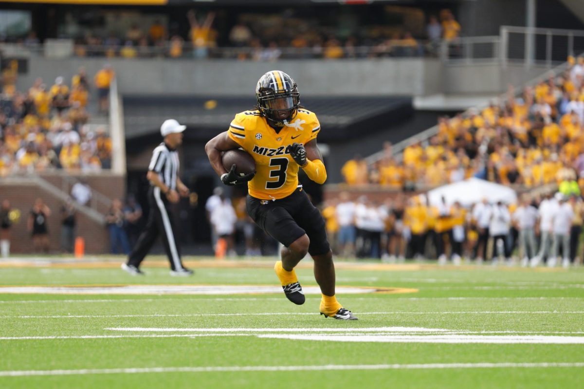
Last came models donning three different combinations of the football uniforms, and the crowd erupted in a noise louder than any throughout the game.
In his collaborative work with Nike, Don Barnes, Missouri’s director of equipment operations, stressed consistency in each team’s uniforms.
As uniforms were unveiled at halftime, sophomore guard Phil Pressey and junior guard Michael Dixon strutted out of the tunnel and bent down to snap imaginary pictures of senior forward Laurence Bowers.
Barnes spoke of the importance of players wanting to look good.
“I wish you could be in (the locker rooms) before the games,” Barnes said. “Our guys will get dressed and they gotta find the biggest mirror. I want to make sure I look good. Yeah, performance is important and all that stuff but they absolutely have to look good.”
Barnes also spoke of the importance of the jersey’s role in portraying the identity of the team.
“We want our fans to be happy, but that 18-year-old recruit, that’s what it takes, Barnes said. “If we get those five-star athletes to sign, it’s about that uniform.(Recruiting is) an arms race for us. Uniforms are the next step.”
Of course, maintaining Missouri’s historical element was another area of emphasis for Barnes during the re-branding stage.
The two new helmet models are without the bold golden stripe that has formed the middle of each helmet since the leather-strapped one in 1948. But the head of a tiger, the evolved symbol of the mascot chosen by the athletics committee in 1890, appears to be a larger emphasis, completely engulfing the sides of the alternate helmet.
“We really listened to what the athletes here from Missouri were telling us,” Nike’s Creative Director for Football Todd Van Horne said. “I think a lot of it was the colors and the tiger and the embodiment of that spirit of why they came here. We really wanted to reflect that in what the uniforms were.”
Despite watching the game on the sideline with the shoulder injury that required surgery when spring began, Franklin spoke with a familiar smile.
“Moving to the SEC, that’s one thing that made everyone more excited and on top of that we have a new look heading into the new conference,” Franklin said. “It gives the fans something to cheer for even more. I think it’s something that can really help us in our confidence heading into next year.”
Long after the game ended, the team store connected to Faurot Field was still open. On a table inside, there was a pile of last year’s game-worn jerseys being sold for $50 each. The twills were frayed on the blocky stitched-on numbers and the jerseys seemed old. A part of the past.